Giving people the power of the self-support!
This story began in Q4, 2022
The Support Hub on TiVo.com, untouched for two decades, had become a cluttered repository of codes, sections, and help articles. This overwhelming maze made maintenance a nightmare, driving users to rely on Google searches rather than navigating the site's own Support section. Recognizing the urgency, the TiVo.com business team initiated a complete redesign of the hub to coincide with exciting new product launches, including TiVo OS and TiVo Car.
This project quickly became the most anticipated in the company's history, capturing the attention of everyone involved. It promised not only to enhance user experience, but also to redefine how customers interact with TiVo's innovative services.
The Story
All existing and perspective TiVo users (DVR & Mini), all the TiVo OS and TiVO Car customers in US, Europe and Asia.
Main Characters
Constraints

All the articles needed to be revised and old redundant un-existing content needed to be removed
IT & Dev teams needed additional support and the outside agency was brought to help implement the changes
The limitations of the SalesForce integration team posed a significant constraint, as their capacity to manage and implement necessary system changes was restricted, directly impacting the project's scope and timeline.
All the help articles needed to be translated in 7 languages (professionally), that was roughly 1200 articles
The Plot

I remember stepping into the user's shoes and feeling their frustration—navigating the Support Hub was like being lost in an old labyrinth with no clear exit. The maze of outdated help articles and broken links made it an exercise in futility. From a business viewpoint, the disarray was more than a nuisance; it threatened our brand's integrity. It was clear: we needed a new hub that not only matched the innovation of our products but also our customers' evolving needs in the US and globally.
Also, the outdated design of the hub clashed starkly with the sleek, modern interface of the Manage My Account section I have redesigned and helped implemented earlier in the year, creating a jarring and confusing experience. This not only made it hard to find relevant content but also deterred customers of all types, leaving us all feeling lost.
So I rolled up my sleeves. The goal was ambitious: to craft a Support Hub that was modern, intuitive, and user-centric, but most importantly the relevant information was clearly labeled and visible from the get-go. I aimed to design a space that felt like a breath of fresh air, with simple navigation and a search function that would give people a power of the self-serv. Out with the old clutter, in with streamlined, relevant content tailored for every device and every user type.
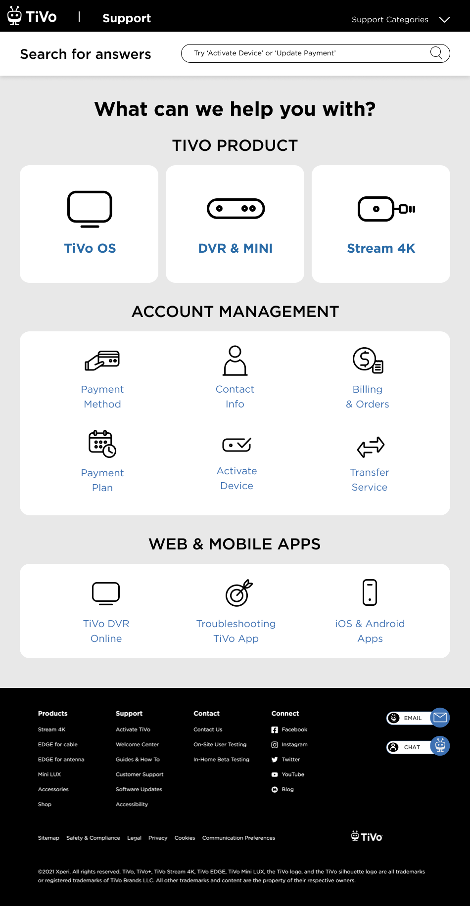
My unique design proposition (based on the research, customer feedback, and all the preliminary work) culminated in the design of a dashboard that would send customers to 4 distinguished subsections: DVR, Stream 4K, OS and Car. Based on the comprehensive data, customers do not cross reference between these subsections, they have a clear understanding which help article they are looking for, thus the design of clearly labeled separate paths for these topics. Search was also optimized and updated because I know that about 45-50 % of customers do use the search function to navigate around.
What Users Are Saying

“I had to call my husband to find a help article for the most common feature, why does it have to be so buried?”
“I tried to search for Stream setup, what seems to be the basic and prominent feature, I couldn’t find any setup help article. Disappointing.”
“The images for MINI setup do not match the MINI device, how can I troubleshoot?”
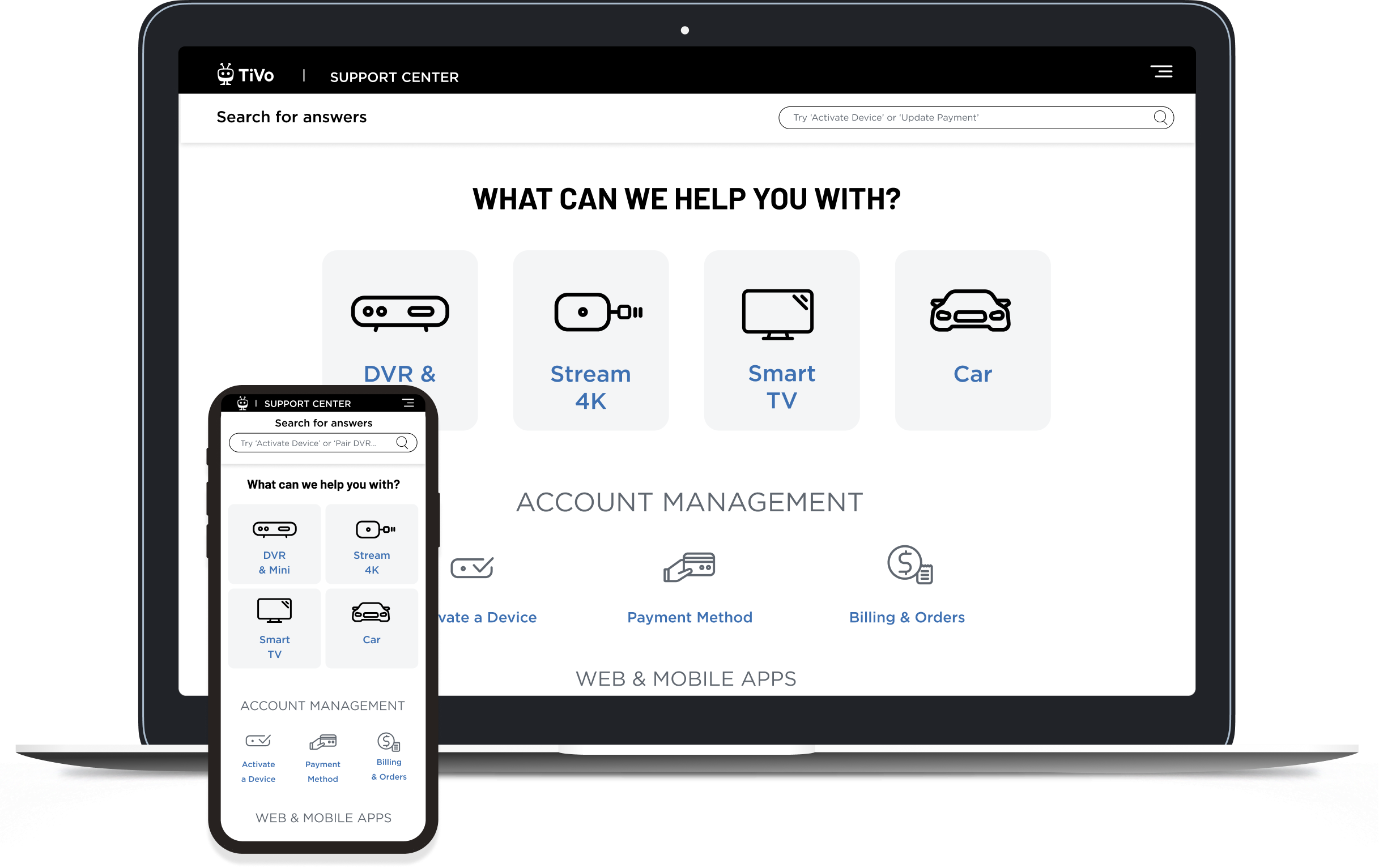
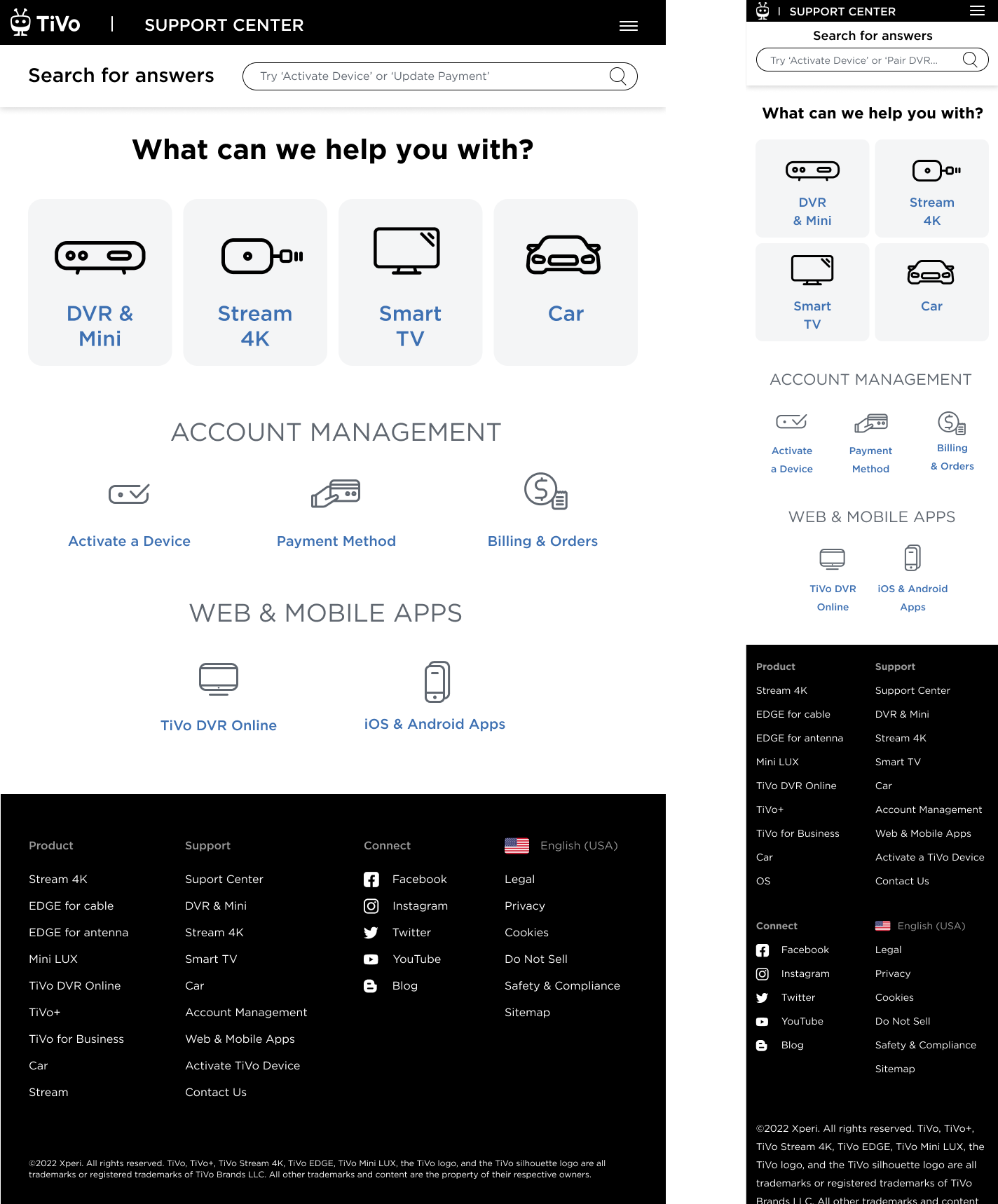
Final shipped designs
-
![]()
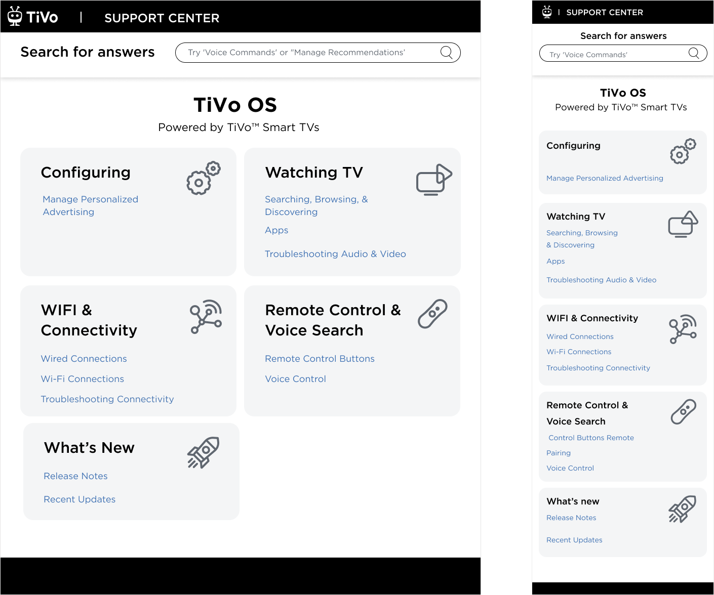
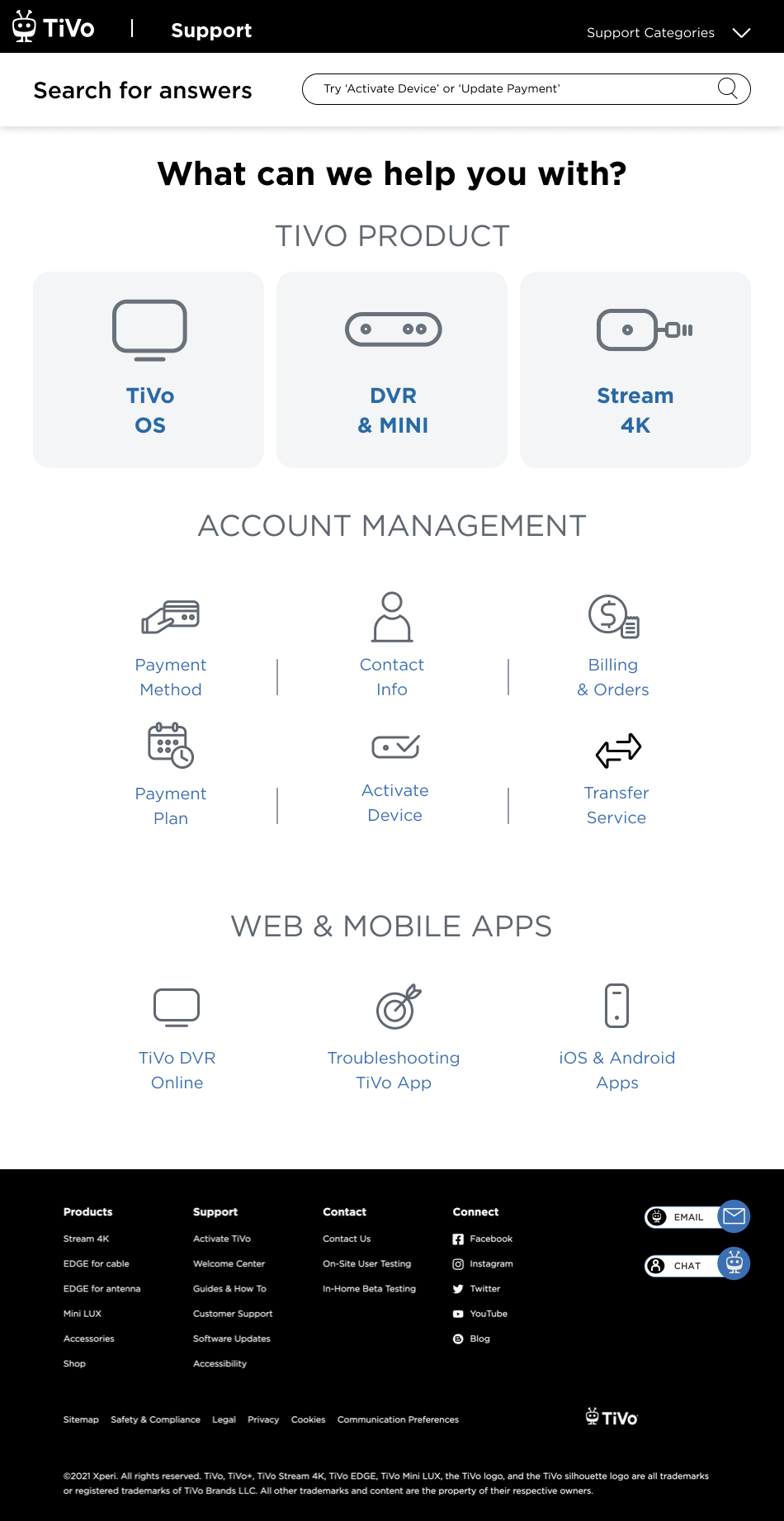
Support Landing Page
-
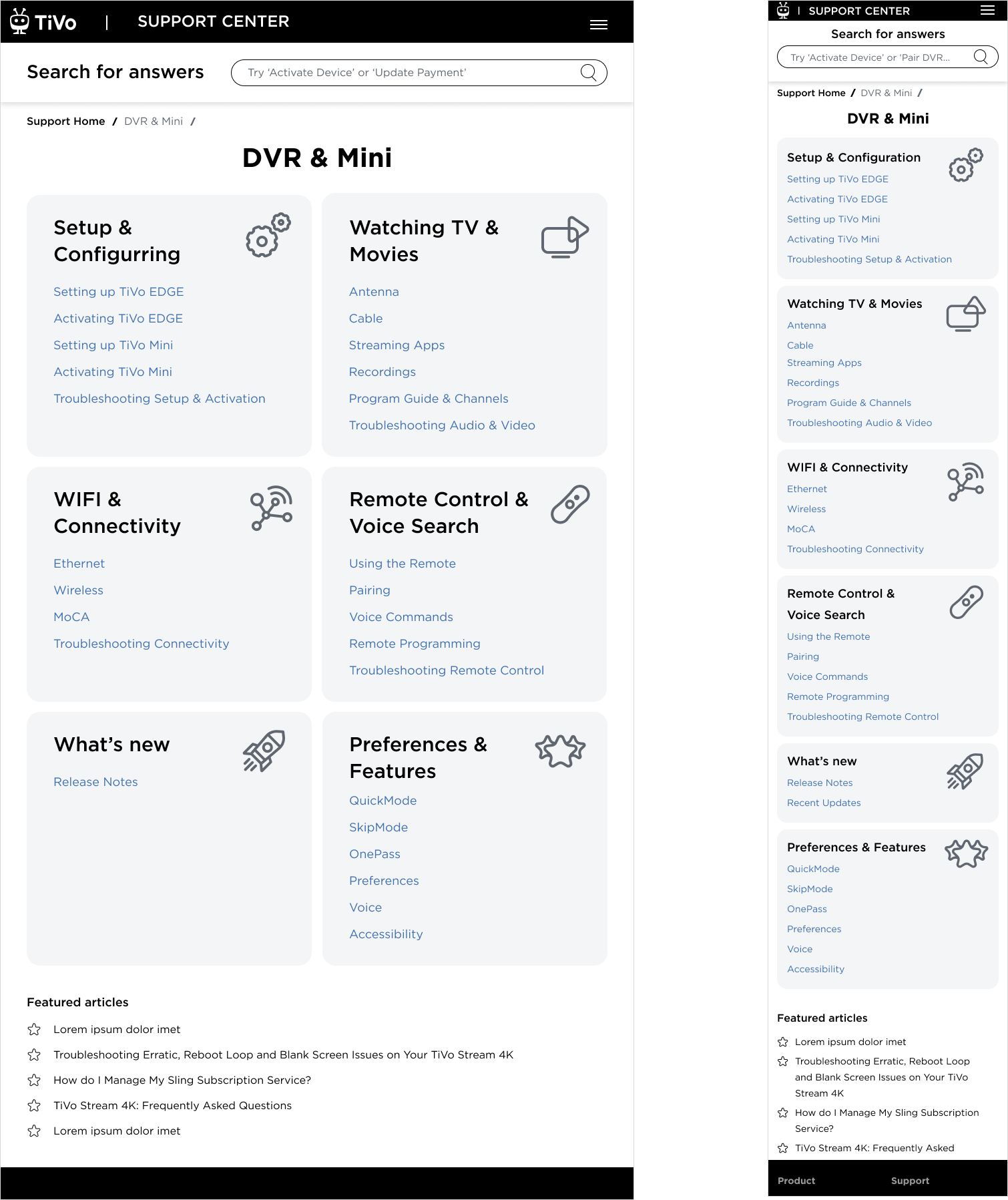
![]()
DVR & Mini Page
-
![]()
Stream 4K Page
-
![]()
TiVo OS Page
-
![]()
Account Management Page
-
![]()
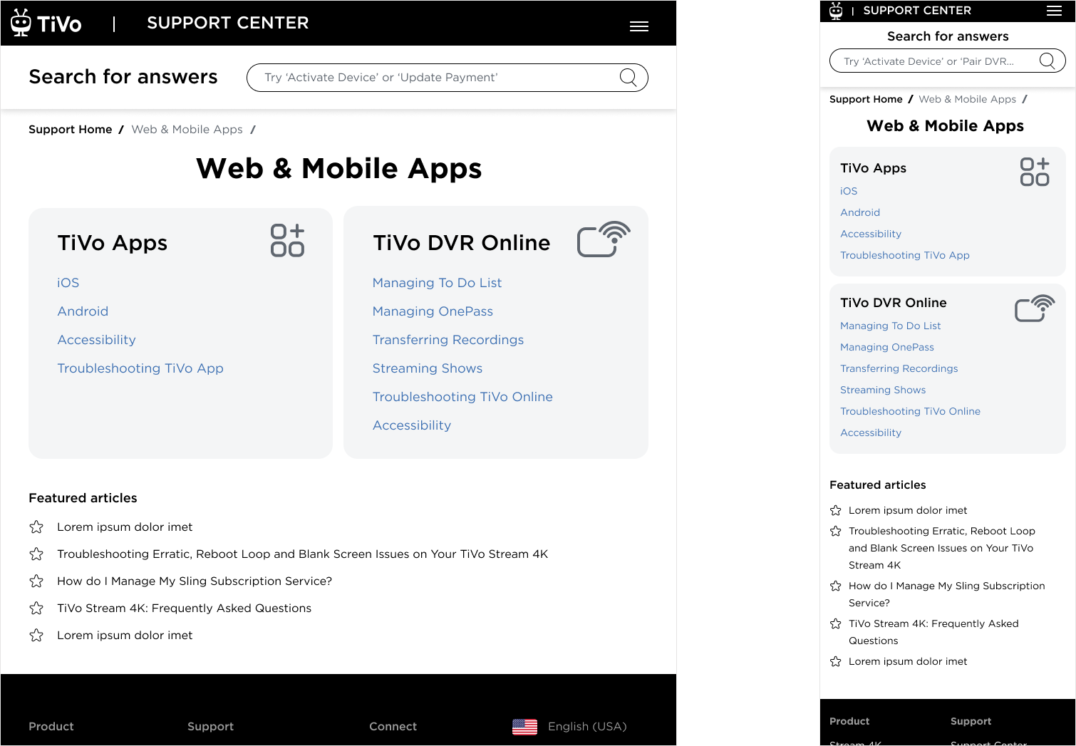
Web & Mobile Page
Description goes here -
![]()
Contact Page
Description goes here -
![]()
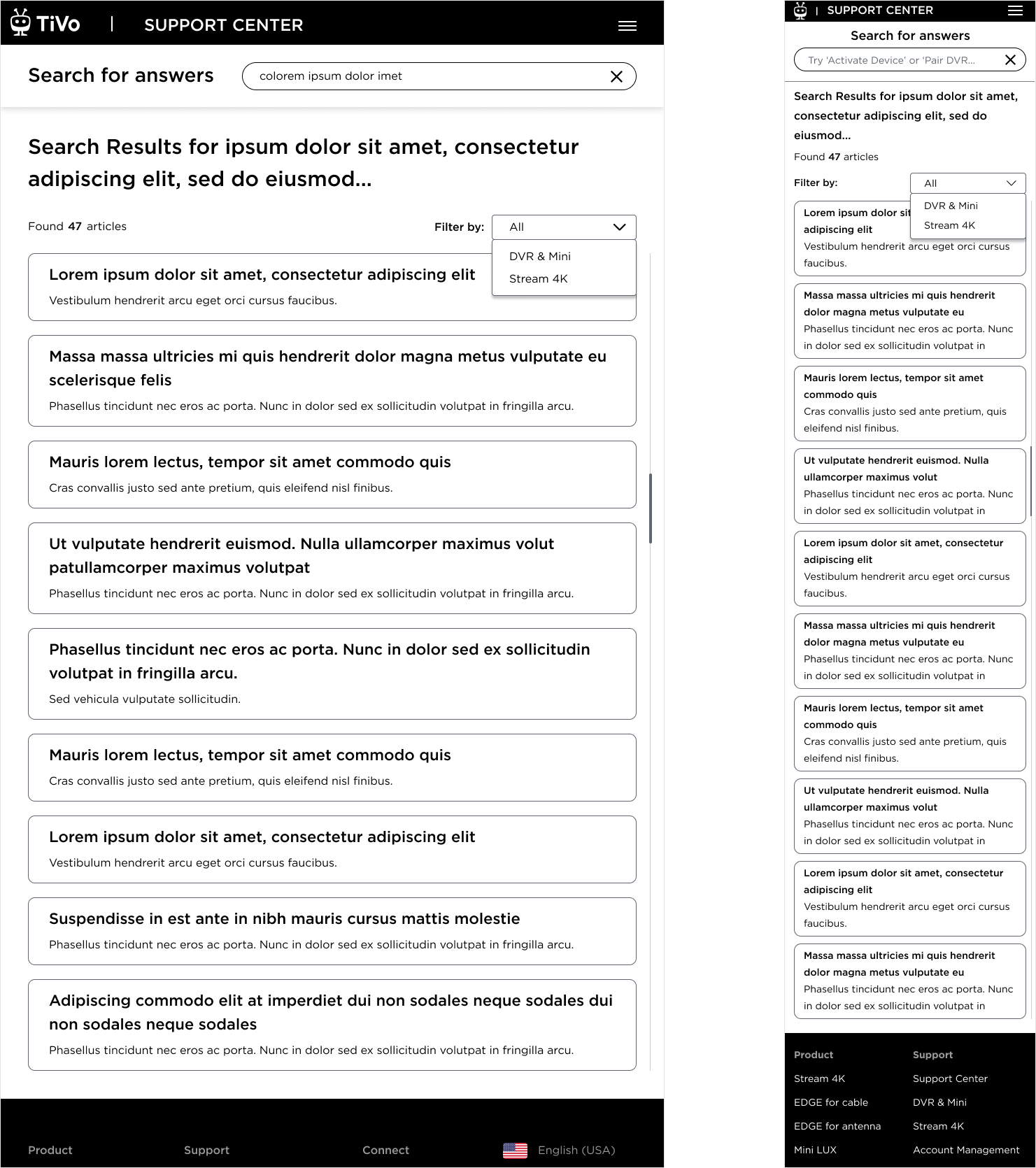
Search Results Page
Description goes here


Resolution

My Efforts Bore the Fruits:
I forged a UX design that resonated with our brand's essence, clear and user-focused, bridging the gap between marketing and support.
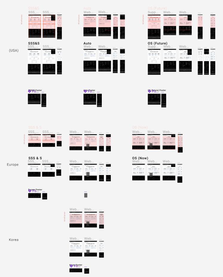
I helped implement TiVo.com IP detection for Korea, fine-tuning our support to be as smart and personalized as our products.
Across Europe, my designs echoed the support in multiple languages, ensuring no user was left behind.
Finally, I made sure that we tested and polished tirelessly, ensuring that the Support Hub wasn’t just rebuilt but reborn.
What Users Are Saying

“Easy to access... very compartmentalize... making sure you’re in the right section to do certain things... able to get to everything just takes one click.”
“Useful site... that provide support in a convenient way... nothing was confusing”
“I’ve used the Roku support, used Xfinity one, but the new TiVo design is better because it’s very straightforward.”
“ Fire execution. Summary and knowledge sharing – a best practice.”
“I am impresses how good this is looking, comparing to our current page on tivo.com. It is amazing!”
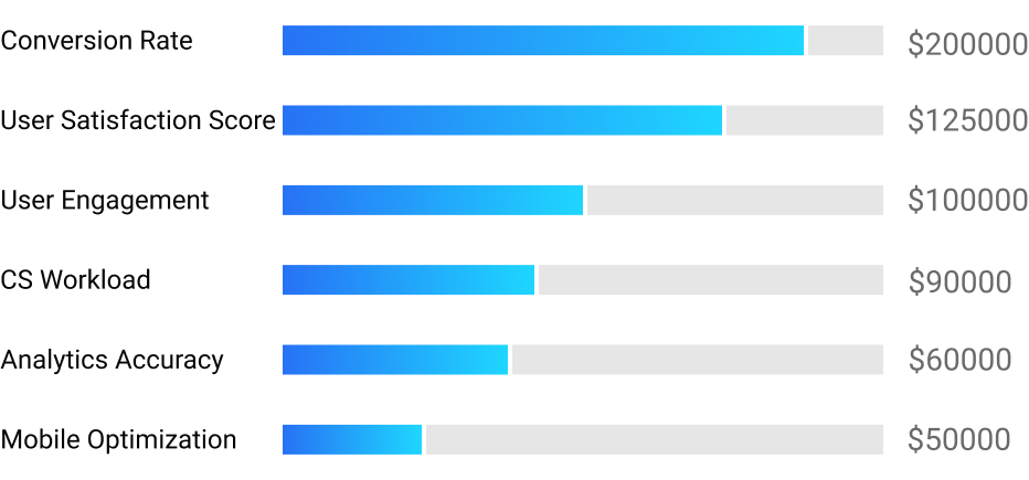
Success Metrics
Conversion Rate: We looked at the rate at which interactions with the Support Hub led to a resolved issue or a successful upsell. This metric helped us understand if the Hub was serving its purpose in aiding and educating users.
Customer Satisfaction Scores: Post-interaction surveys gauged how customers felt about their Support Hub experience, giving me direct feedback on the redesign and opening new ideas for the future improvements.
Customer Engagement: I overseen tracking the average time spent on the Support Hub, with an expectation of an increase, indicating that users were finding the content engaging and useful.
Customer Support Workload: A 75% reduction in tickets and calls to customer support were reported, indicating that customers were self-servicing successfully through the Support Hub.
Analytics Accuracy: My idea of an introduction of effective analytics was a game-changer, providing an invaluable data about customers behaviors and action patterns.
Mobile Optimization Success: With a significant portion of users accessing support via mobile devices, a decrease in mobile bounce rates and an increase in mobile session durations would signal a successful optimization.
The cost savings and additional revenue in 2023: $845,000
Epilogue

As the Product Designer spearheading the high-profile redesign of the Support Hub on TiVo.com, I was presented with a formidable challenge. This wasn't just a facelift; it was a complete overhaul of a system that hadn't seen innovation in over twenty years. My mission was clear: transform this outdated maze into a beacon of help and information for all types of TiVo customers (using an established by me and my visual designer Design System).
I kicked off this journey with the excitement of aligning the Support Hub with the launch of TiVo OS and TiVo Car, a step that would bring the TiVo UI into the homes and vehicles of users across the US, Europe, and Asia. My project wasn't just anticipated; it became a cornerstone of TiVo's commitment to customer service.
With a vision to create a modern, scalable, and seamless experience, I delved into design. My aim was to strip away complexity and introduce a simple, intuitive navigation system. I refined the search function to intuitively surface what users sought, retiring outdated articles that no longer served their purpose.
I didn't stop there; I created a system of scalable templates for mobile optimization, ensuring a smooth experience on any device.
‘The more you leave out, the more you highlight what you leave in.’― Henry Green
but just in case you were wondering about ‘More’ - below is my ‘Design Kitchen’
What measures did we take to provide user insights?
Design Kitchen
-
I began this project by defining key research goals:
To understand what are the sections or topics that customers access the most in the Support hub (used analytics)
To understand how the competitors deal with common issues
To understand optimal set of subsections customers will need
-
Key learning:
75% of the users who are using the support features are DVR & Mini customers
20-25% of users are Steam 4K customers
For newly launched products, we are estimating 10% of the customers will review the support pages
-
Insights:
Support on TiVo.com is a repository of help articles in 4 major separate buckets: DVR, Stream 4K, tiVo OS, and Car
There are 3 most visited topics in Support site: Activation, Guide LineUp, Account
Users want to know how to navigate through the Support subsections and helps pages
Frustrations:
OLD articles that do not reflect current functionalities and information, and therefore are useless
Confusing navigation that doesn’t allow customers to get to the page which they think they are going
Unpredictable and not optimized search
Outdated look and feel that makes the site look like it is from the last millennium
-
After I had the key screen wireframes, a prototype was put together in Figma and UIzard where I conducted usability testing with 8 participants. Below are the different scenarios the participants were asked to complete:
Task #1: User wants to learn how to activate their DVR device
eTask #2: User searches for the DVR Online settings
Task #3: User is interested to read about Stream 4K browsing experience
-
After establishing the design strategies and user needs, I worked to outline the sitemap. From here, I started to ask some important questions about what sort of features/screens are needed for an optimal experience?
How would a customer navigate the site? What happens when they access it from the Google search? What could they do in subsections?
View
-
Once the general skeleton of the site was set, I considered how a user might engage with each screen to complete certain tasks.
Before & After at a Glance
Landing Page: Before

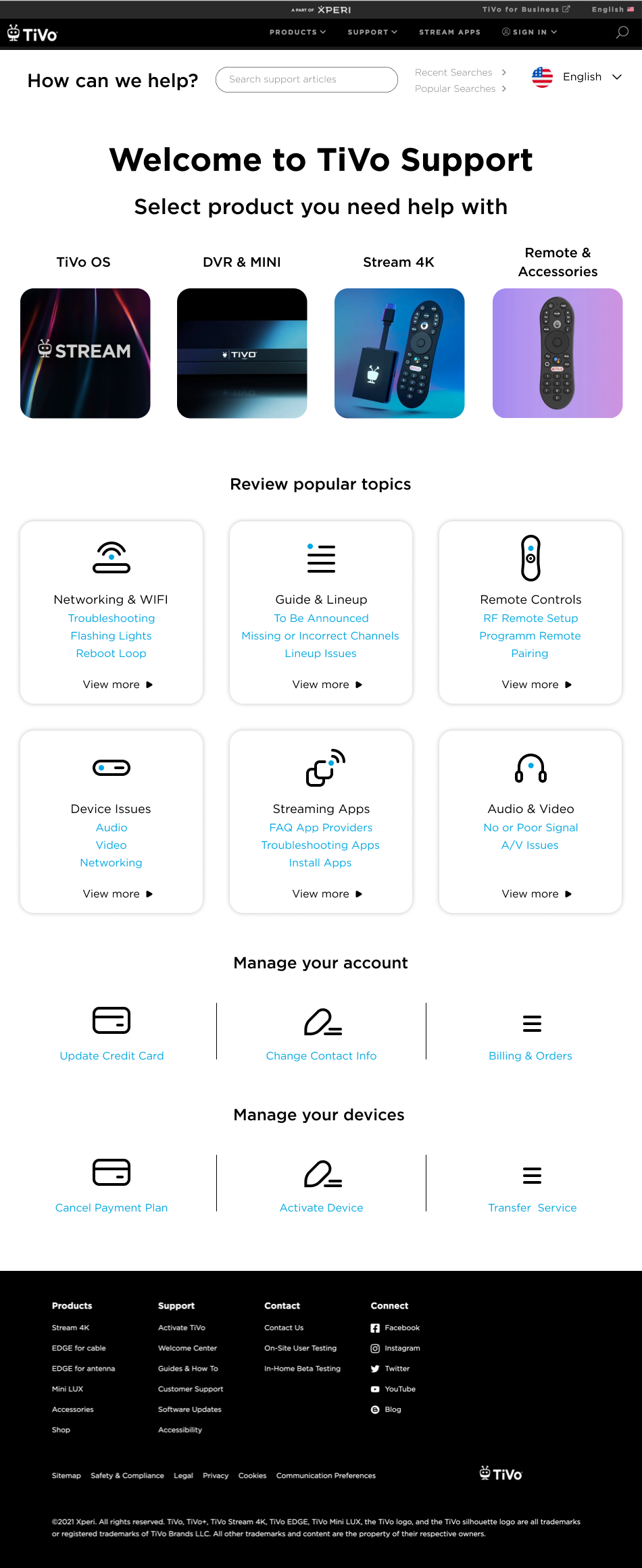
Landing Page: After
Subsection Page: Before
Subsection Page: After
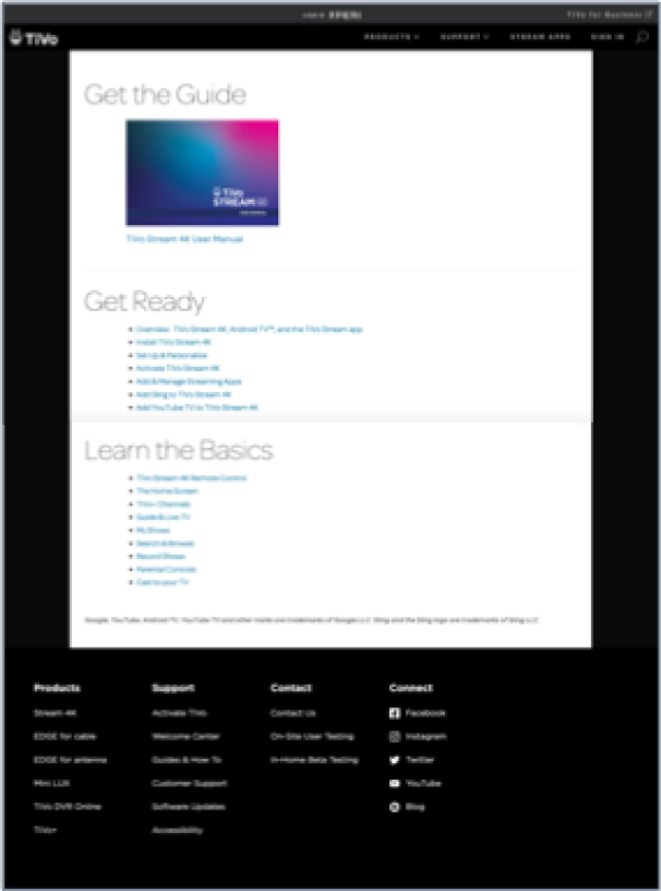
Help Article Page: Before
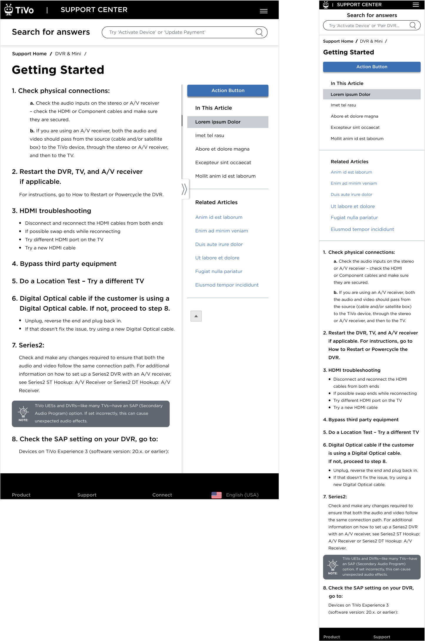
Help Article: After
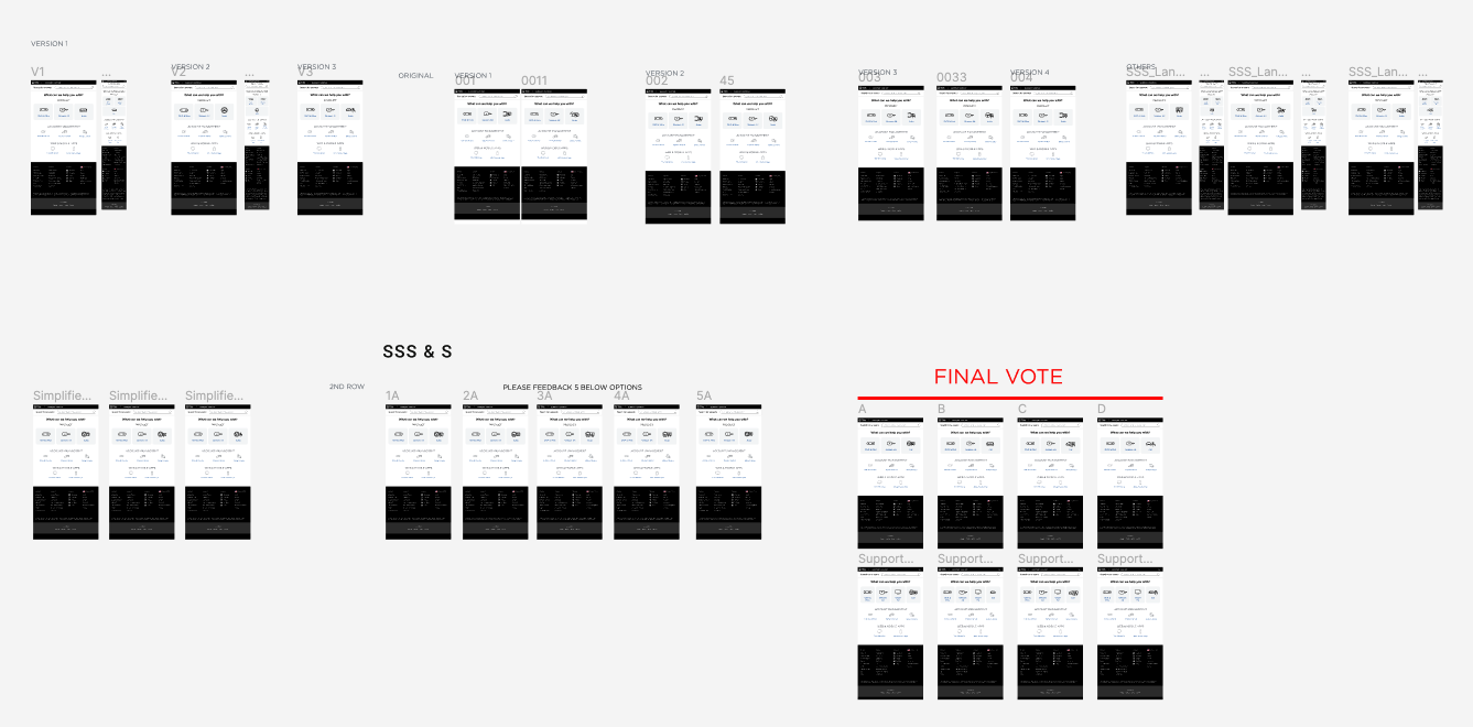
Early Prototypes
The quick prototyping was tested with customers, and from their feedback the winning option was selected for further iterations
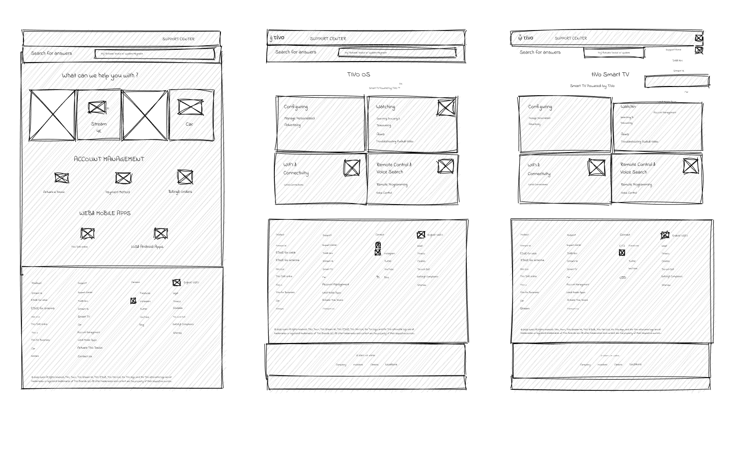
After collecting the feedback from all the low-fi prototypes, taking feedback from user testing sessions, and solidifying the foundational framework, I started to form final mocks that were presented to stakeholders.
3 Design options were presented to the stakeholders
-
![]()
Support V1
This idea was based on displaying images representing 4 types of products TiVo offers (top of the screen). Mid screen would display popular topics.
-
![]()
Support V2
This idea was based on having TiVo products represented with icons. The screen is divided into 3 sections based on the most often preformed actions.
-
![]()
Support V3
This idea is based on emphasizing 3 (or more) TiVo products at the top, and the rest of the screen would display important topics.
Design Boards