Mobi TV’s Sign Up Solutions
Prologue
In Q3 2023, I was approached by the business team at MobiTV (a TV streaming service owned by TiVo, which provides live and on-demand video delivery solutions to pay TV operators around the world) and asked to help with Sign Up project designed to entice customers to sign up for popular streaming app services using one of three methods: QR code, Web pages or Customer Service Representative service. Once a customer signs up, MobiTV would receive a bounty that they would share with the operators.
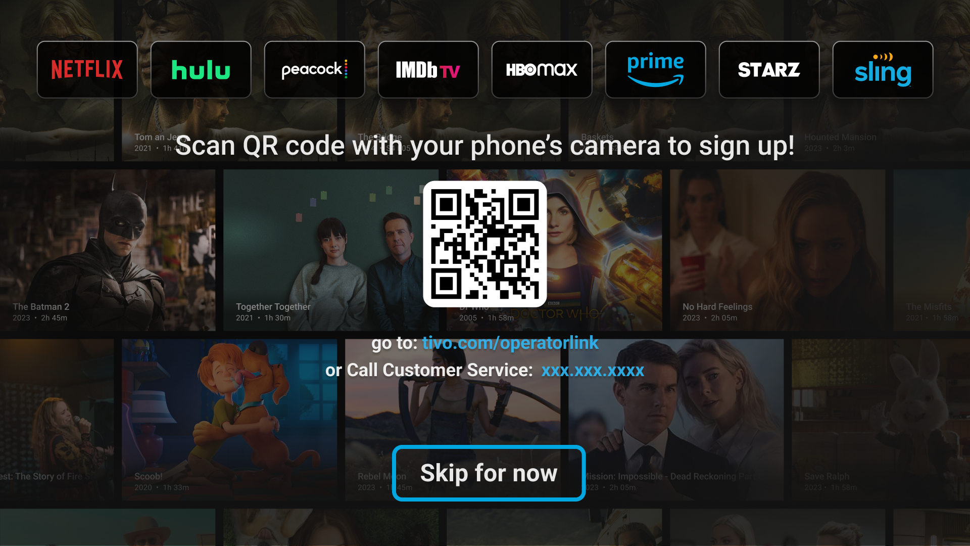
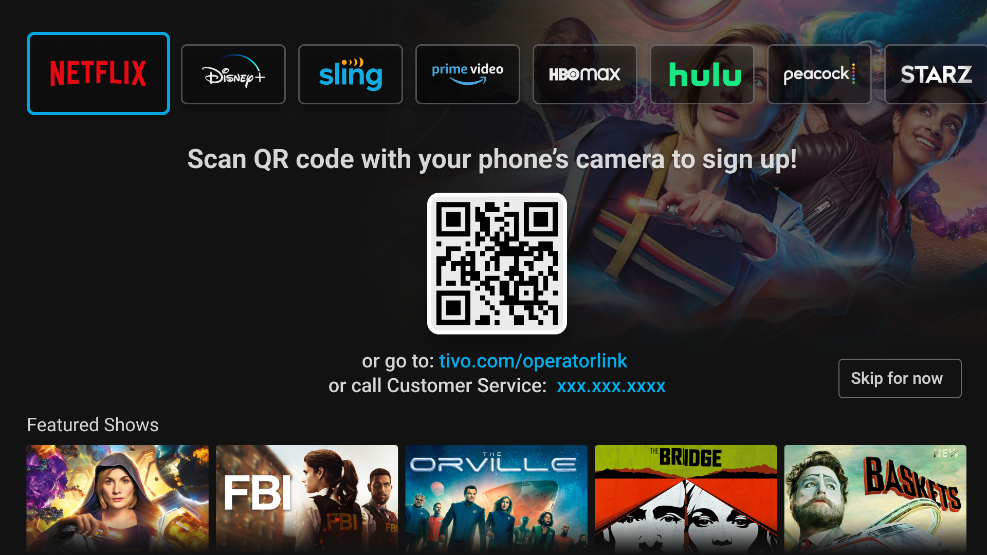
Starting TV screen with 3 sign up options would be presented to users after they booted their TV device.

If the user would choose to call Customer Service rep, he would create an order form and fill out the customer’s information.

Special form that CSR have to fill out when the customer calls in.
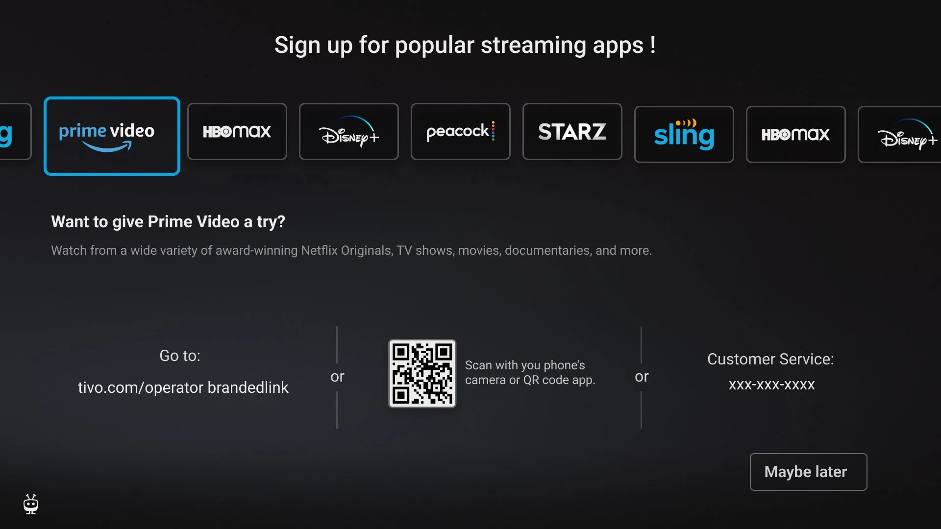
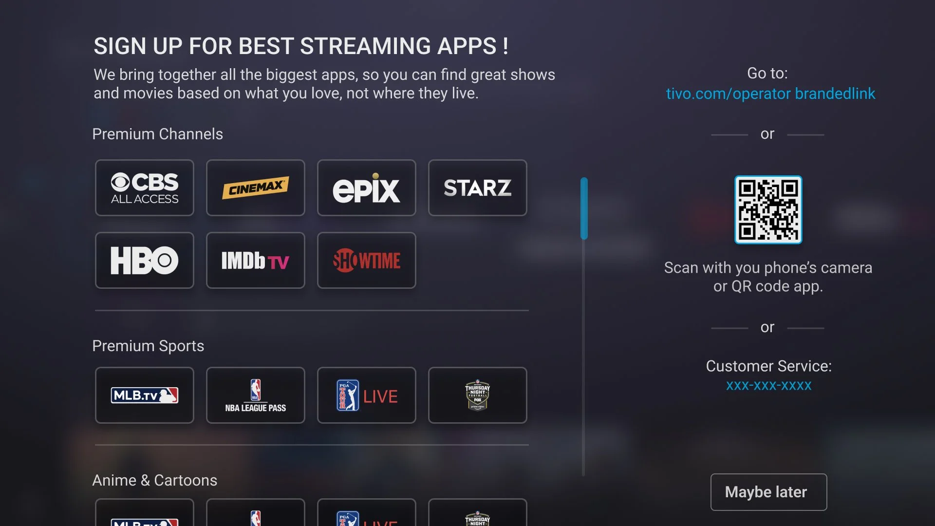
Templetized web pages for partners to showcase their promotion offers (Mobi).

Utilizing existing page templates for partner’s content (TiVo)
The Story
Mobi TV unmanaged subscribers in US and Europe.
Main Characters
Tags
B2B
B2C
SaaS
Segmentation
Personalization
• In Phase 1, the promo screen is going to be a simple display of the flat screen with promo details and a skip button
• In Phase 1, there will be no tracking of what apps the user may currently have
• CSR will not know if the customer already signed up for a specific app or not, there is no tracking or verification mechanism
Constraints
The Conflict
Gathered form the analytics and industry statistics, the highest dropout rate occurs when users are prompted to perform additional actions after booting up their devices. They prefer to immediately start enjoying their TV viewing experience rather than spending extra time on other tasks. My role was to design simple and effective methods that allows users, if they wish, to sign up for additional streaming services. The overarching goal was to accommodate all typers of user preferences.
All users favor a streamlined signup process via their mobile device or web. Among them, using a QR code is the most popular method for quick access. Some of the users prefer to go directly to the web site and finish sign up process there. Very low percentage of users (around 8%) prefer to use CSR agents.
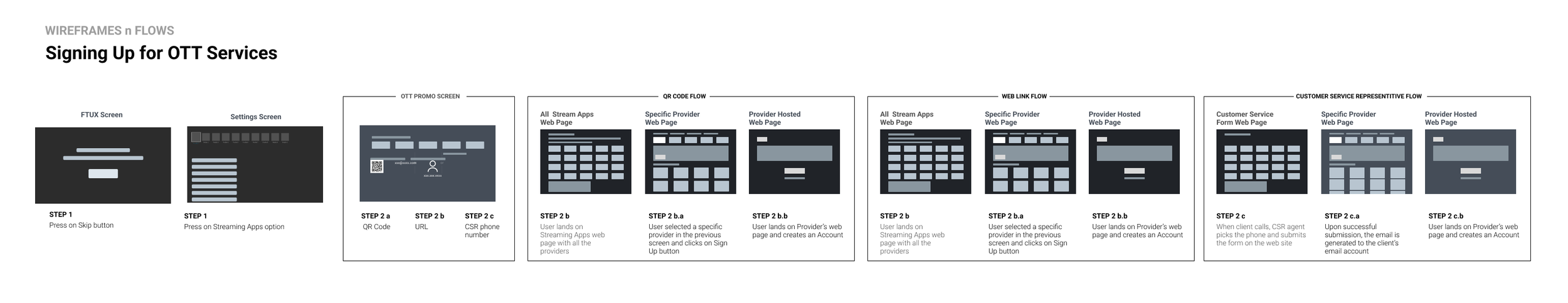
Because of the very tight time constraints and a small dev team, the existing https://www.tivo.com/stream-apps templates would need to be reused.
Separately, there was a need to create CSR web pages, so that the agents can help customers with sign up in most effective ways.
The Plot
Based on all the research I have conducted, Mobi users distinctly fall into three categories: "the geeks," "the sticklers," and "the traditionalists." With these insights, I designed a user experience that is both intuitive and straightforward for all of these types.
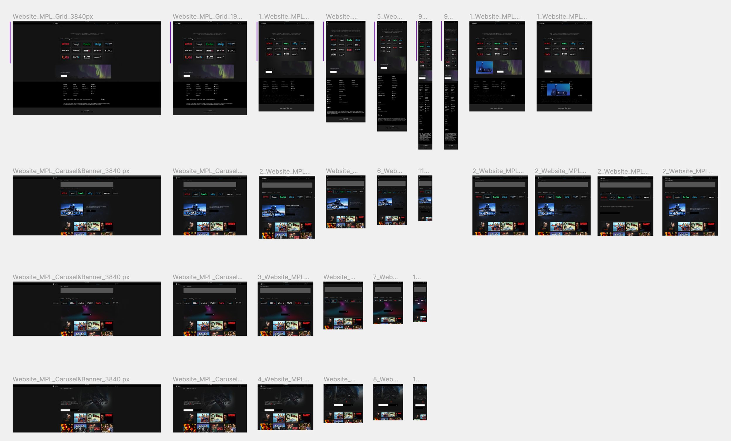
The design process began by establishing three distinct, enjoyable, and efficient signup flows, allowing users to select the method that best suits their preferences. To ensure rapid and consistent development, I used templated web pages, I have designed for the Streaming apps web pages.
The core objective was to enhance customer satisfaction and insure the sign up (from the business perspective it is important to keep in mind that for each sign up, Mobi would get a bounty from the content provider). By tailoring the user flows to different personas, I addressed the specific needs, limitations, and behaviors of each user group, ensuring a more personalized and effective experience.
My designs underwent multiple tests and revisions based on feedback from focus groups. This iterative process informed stakeholders, and chosen design directions were implemented. By cleverly reusing my design templates, the development team was able to accelerate the creation of new pages. Additionally, customer service representatives were trained on a simplified design flow that consists of three steps, enhancing their ability to assist users efficiently.
This approach not only streamlined the development process but also ensured that each user type could navigate the signup process with ease, significantly boosting overall user satisfaction.
Preliminary metrics for a sign-in flow using three different methods: QR Code, URL, and Customer Support rep. Each method is evaluated across various metrics, including time to completion, success rate, user satisfaction, error rates, dropout rate, and the extent of customer support interaction needed.
Success Metrics

Epilogue
Reflecting on the project, my final designs appeared straightforward and intuitive, yet achieving this simplicity was an extensive process that involved considerable research and persuasive efforts to secure stakeholder buy-in. In product design, recognizing the uniqueness of each user type is crucial. While I categorized users into three primary groups for initial clarity, it's understood that user diversity extends beyond these categories. I believe, however, that these classifications capture the most impactful user behaviors and preferences, forming a robust foundation for our initial launch.
The Next Steps
Collecting and analyzing user interaction data (after the launch). This analytics-driven approach allows me to observe how different user segments engage with the product. Based on the insights gathered, I would enter an iterative phase of design adjustments. This involves refining and optimizing the user flows to better meet the needs revealed through actual usage patterns. The goal is to enhance user satisfaction and improve engagement metrics.
Concurrently, i would continue user research to uncover deeper insights into less prominent user groups or emerging usage trends. This may involve qualitative methods like interviews and usability testing to complement quantitative data analytics.
Lastly, I would regularly update stakeholders with findings and integrate their feedback into the development cycles. This collaboration ensures the product evolves in alignment with business objectives and user needs.
‘Make things as simple as possible, but not simpler.’― Albert Einstein
but just in case you were wondering about a few more things - below is my ‘Design Kitchen’
Design Kitchen
Below technics and processes were used in development of final designs.
-
I began this project by defining key research goals:
Who are the users that would interact with 3 different ways to sign up?
Where and how would they access their devices to sign up?
Will they use 1 option only or alternate?
-
My key learnings:
1. Sign up alternatives is important to 65% of users.
2. All our competitors offer different ways of signup for additional apps.
3. All our competitors provide an additional entry point for app signups—typically accessible from the settings section—if the user initially dismisses the signup screen.
-
Insights:
Each type of users prefers a different method of signing in depending on their life experience, age and experience in technology.
Frustrations:
Having to remember multiple usernames and passwords for different streaming services.
Complicated sign-up process for streaming services.
Having difficulty navigating through the streaming service website.
-
After I had the key screen wireframes, a prototype was put together in Figma and UIzard where I conducted usability testing with 10 participants. Below are the different scenarios the participants were asked to complete:
Task #1: User want to discover new and interesting content to enjoy.
Task #2: User wants to have a seamless experience.
Task #3: User wants receive prompt and effective customer support.
-
My Role
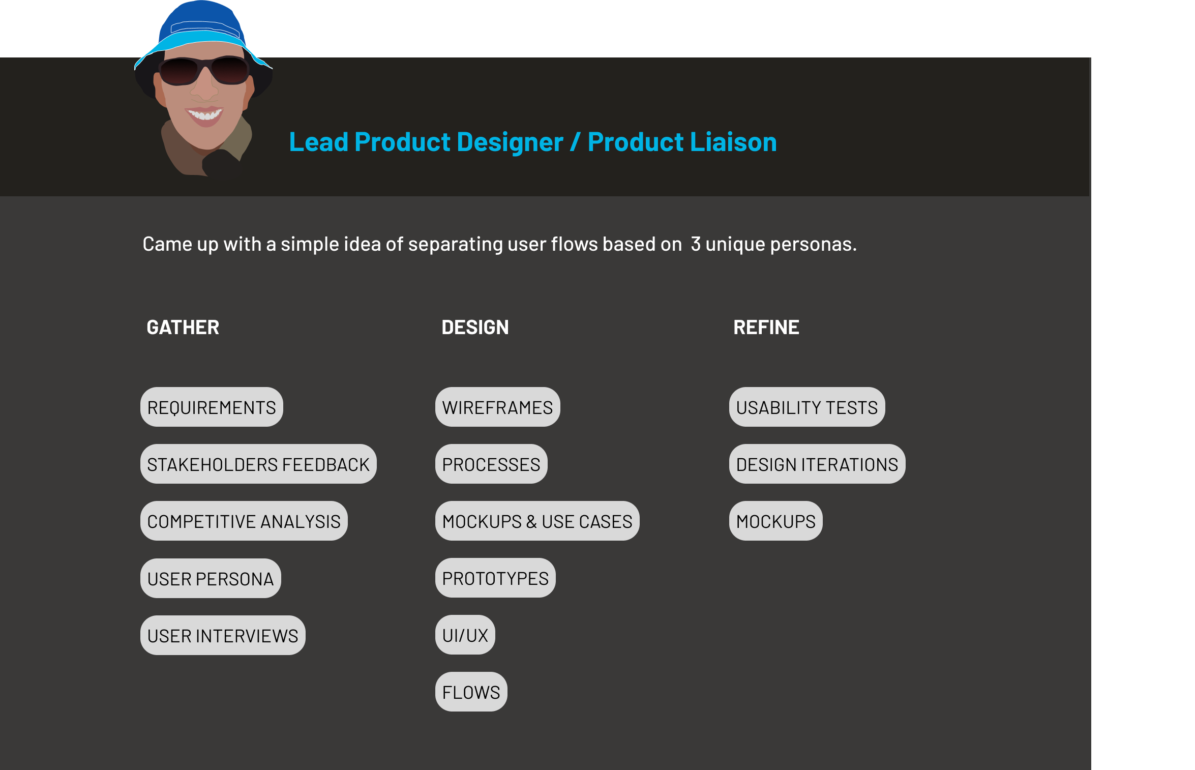
Mobi’s Uniques User Base
After running an exhaustive usability studies, interviews and conducting questionnaires, I have concluded that each user type should represent a different approach to engaging with technology and customer service, highlighting the need for diverse strategies to accommodate varying preferences and expectations in service design.
1: Geeks
Uses QR code for sign up to streaming services.
Main objective: The primary goal for this user is to complete the signup process as quickly as possible. They value fast, efficient, and hassle-free procedures.
2: Sticklers

Prefers to go to the web site and browse the options.
Main objective: The primary goal for this user is to see all available options, understand the differences, and compare these to make the best choice. This involves a keen interest in the details and fine print of offers.
3: Traditionalists
Do not trust the QR code and have different types of expectations from signing up. Want to have a concierge type of service.
Main objective: The primary goal for this user is to have a personalized guide through the signup process. They seek direct human interaction to ensure their questions are answered and their concerns are addressed, providing a sense of security and trust.
Sign In TV Screen Design Comparison

Confusing messaging
Unappealing UI
Unclear interaction
Before
I introduced a clear, concise and prioritized messaging
Designed an appealing UI
Created simple interaction flows
After
User Flows
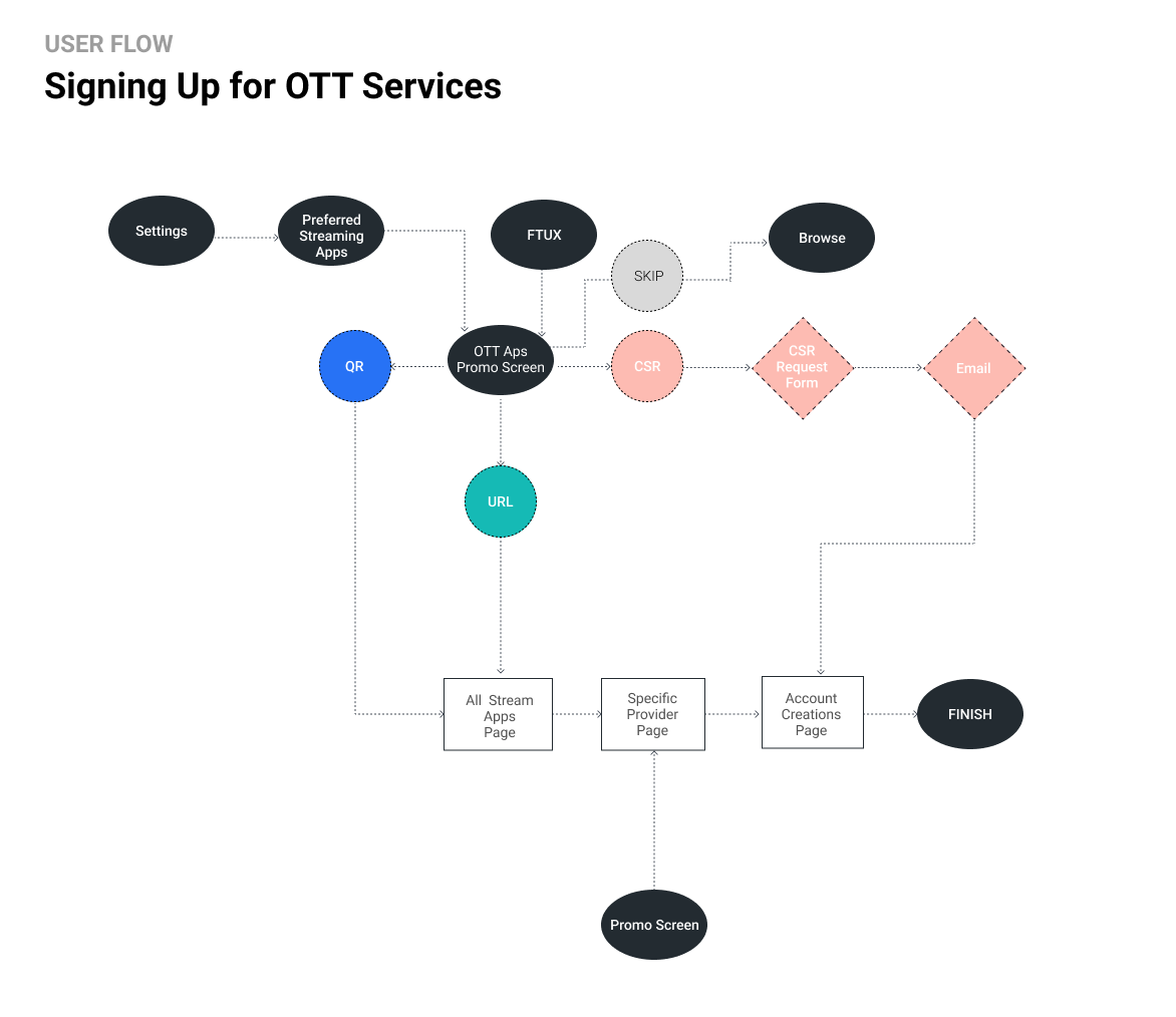
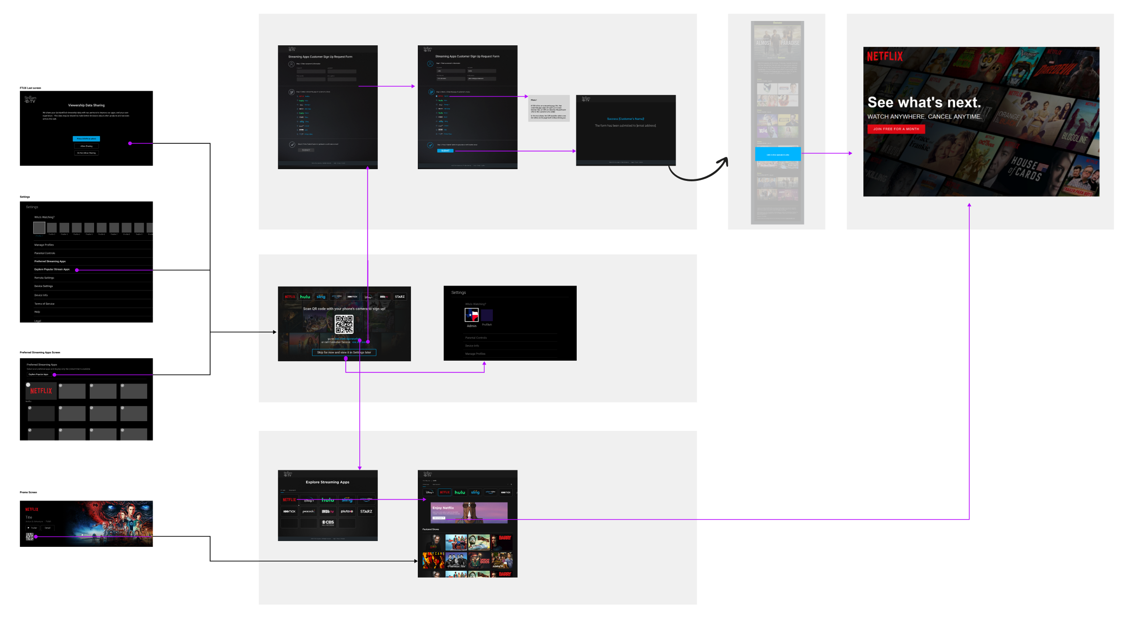
Keeping 3 unique persona needs in mind, I created a user flow diagram where the key screens and interactions were identified with the goal accessing privacy policies and setting up device specific rules. By mapping these pathways out, I was able to define the required screens and develop a logical flow for 3 types of persona: The ‘geek’, the ‘stickler’ and the ‘traditionalist’
TV Sign Up Screen: 3 design options were
presented to the stakeholders
-
![]()
OTT Version 1
-
![]()
OTT Version 2
-
![]()
OTT Version 3
Design Boards
The sign up can happen from 3 trigger points: TV Sign up screen, TV Settings screen and Preferred Streaming Apps TV Screen as shown on the diagram below.