Promoting channel brands through
smart interactions
Prologue
Online.tivo.com (TiVo DVR Online) was my very first product I have designed when I started working at TiVo. Funny enough that the redesign of the Guide section - became my last project I have designed for TiVo, so you can see how i am emotionally attached to it.
TiVo DVR Online is successfully used by TiVo subscribers and other content providers, such as Comcast, RCN, Virgin Media and more across the globe, serving roughly 18 million clients in 10 countries, using SaaS features (recording, scheduling, managing, and etc). In Q1 2022, it pivoted and positioned itself primarily as a streaming platform. This new strategic position was established, thus initiating a significant effort to redesign and add features to the Guide section (most visited section of TiVo DVR Online).
This story will focus on one aspect of the Guide redesign: the Guide Channel Info Card, an overlay that allows users to interact with channel-specific information.
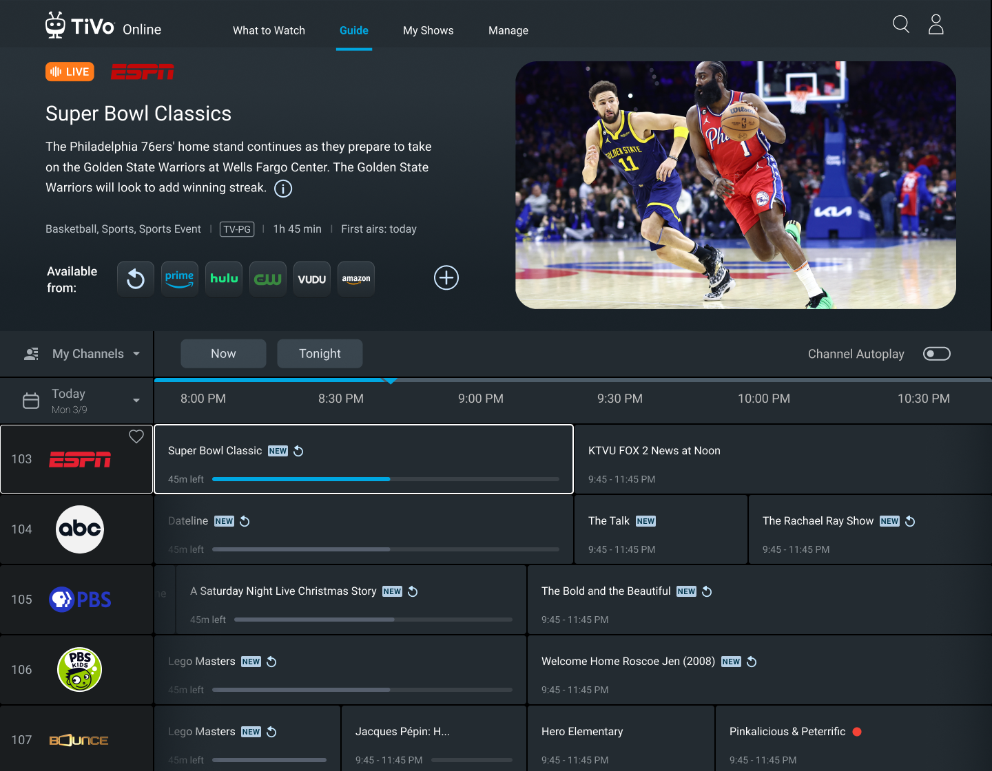
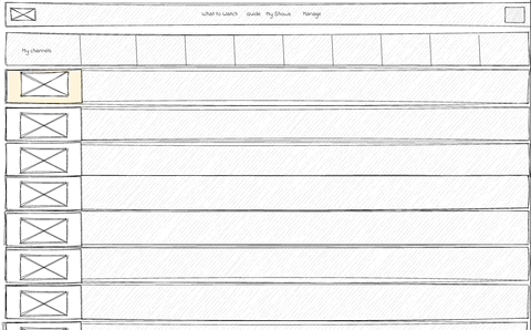
Guide with a highlighted channel and a show currently playing (Live)
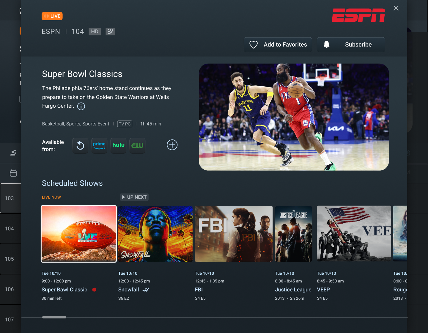
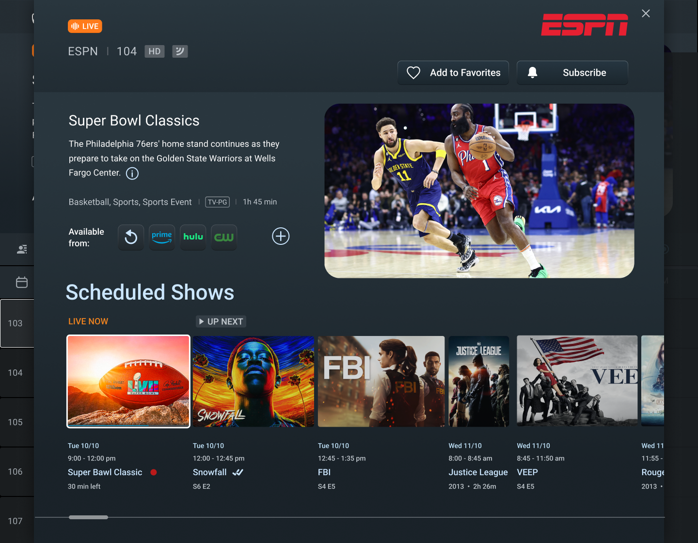
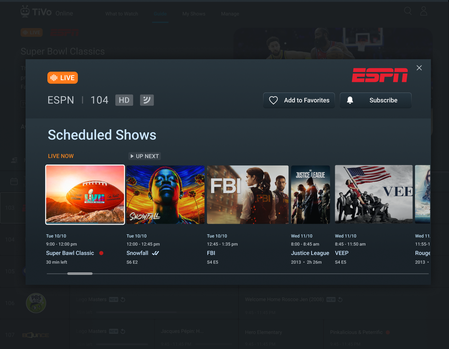
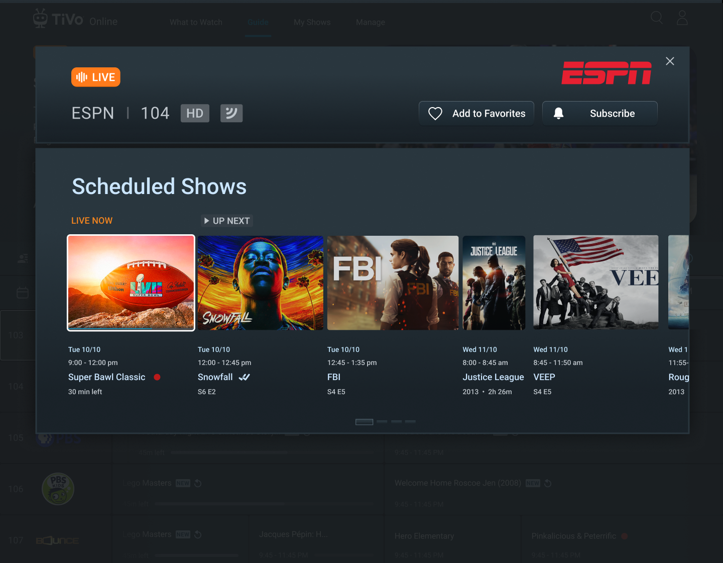
Channel overlay (Info Card) with information about the specific channel, CTAs and scheduled shows

Show in the future that is not Live
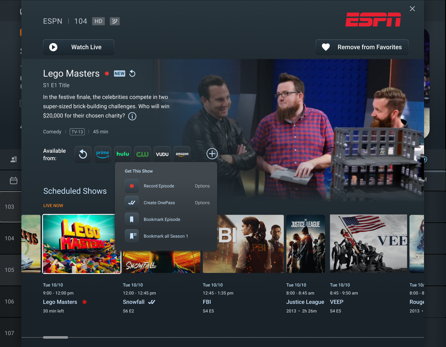
CTA is triggered and contextual options for the show are visible
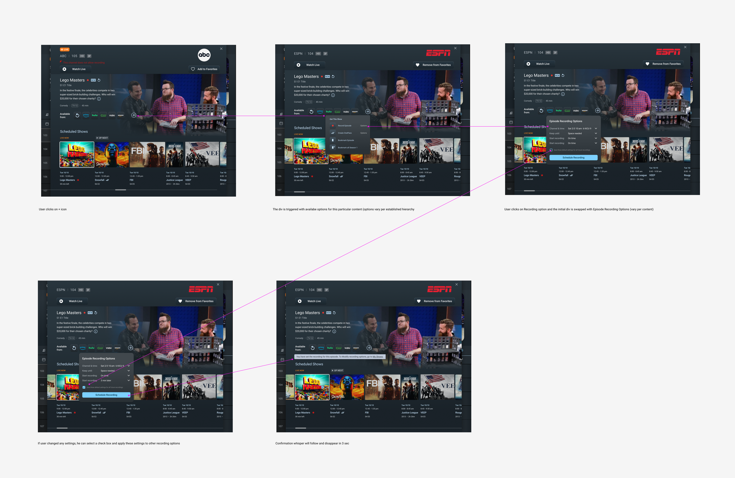
Designed a consistent flow with established design patterns and interactions
The Story
All existing and perspective TiVo users on TiVo and partners’ platforms covering US and LatAm countries, roughly 18 million customers.
Main Characters
B2B
Tags
B2C
SaaS
Streaming
Content Transfer
Not All API’s will be ready for the time of the launch, so potentially some of the info will be served in existing format, not the updated design
Live Video player implementation may not be ready for the time of the launch, thus I have created a Plan B design treatment to have a static placeholder with an atmospheric image representing a show, instead of the player
Team in Romania consists of junior developers not quite familiar with complexity of the guide
Constraints
TiVo customers looking to enjoy their favorite shows face a complex and cumbersome process to navigate and select channels in the Guide section of the site. The absence of a dedicated space to access channel-specific information adds to the inconvenience, leaving users without a clear understanding of channel offerings. Fundamental actions like favoriting or un-favoriting channels are not user-friendly, leading to customer frustration.
Additionally, content providers for these channels lack the means to effectively promote their brands or provide additional information, missing valuable engagement opportunities.
Conflict
My solution to enhance the TiVo user experience with the channel guide involves several user-centric improvements. First, the interface will be simplified by de-cluttering the channel cells in the guide, stripping away unnecessary decorations to minimize cognitive load. This cleaner approach will help users navigate the guide more intuitively.
Next, by introducing a dedicated 'Info Card' for each channel, users will be able to click on the channel logo to easily access detailed information about the channel's brand, available shows, and scheduling, streamlining the learning process.
Action buttons will be standardized across the platform, utilizing newly established interaction patterns to provide a consistent and engaging experience. This design consistency is key to fostering a positive user interaction with the system.
Lastly, the functionality for favoriting and un-favoriting channels will be refined to a one-click process. This change aims to greatly increase user satisfaction by making channel selection more efficient, allowing users to access their content faster and with less effort.
The Big Idea (how might we…)
The Plot
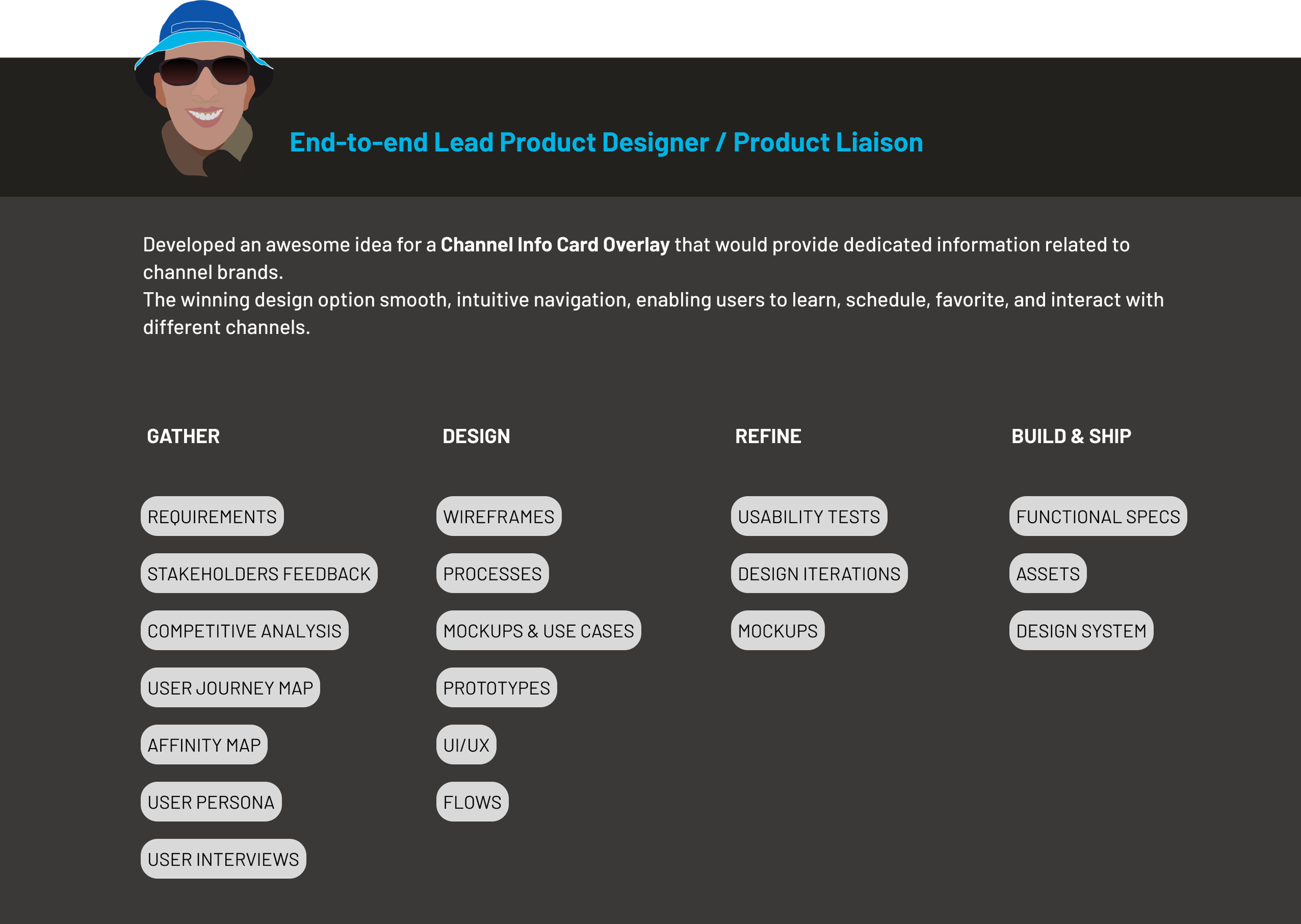
As the Lead Product Designer, I spearheaded the innovative redesign of TiVo's user experience, drawing upon extensive research and user feedback. My role was pivotal in conceptualizing the Channel Info Card—a user-centric overlay that enhances the guide browsing experience. This overlay, activated by a click on any channel cell, consolidates crucial information and provides necessary call-to-action (CTA) options that both users and providers have expressed a need for, such as favoriting channels and scheduling shows.
The decision to implement an overlay rather than navigating to a separate page was a deliberate one. My design philosophy aimed to maintain the fluidity of the user's browsing journey. Recognizing that users often scroll through channels to explore options—a behavior pattern not only common but also efficient—I advocated for an in-line experience. This overlay design ensures minimal disruption, thereby keeping users engaged with the guide without pulling them away from their exploration.
I also thoroughly evaluated mobile user interactions and devised an optimal solution for mobile devices. However, after presenting this solution, the business decided not to prioritize mobile optimizations for the guide. This decision was informed by our data, which indicated minimal usage of the guide on mobile devices. As a lead, my responsibility was to align the design with strategic business goals while ensuring the best user experience within the given parameters.
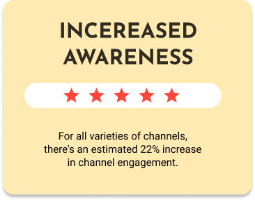
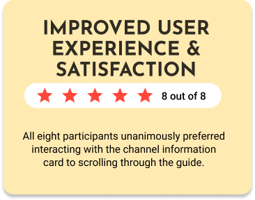
Since this feature is still in development, I do not yet have the final analytics regarding user engagement with the Channel Info Cards. However, based on early feedback from study groups and usability testing, the following are some of the reported improvements:
The Impact


Epilogue
This is a story of realizing the crucial importance of aligning UX closely with developers and engineers. Such collaboration is fundamental. I wish I would have involved my developers much earlier in the game. Getting their valuable insights earlier would have given me better perspective and understanding of the technological limitations thus informing the design perhaps for a more robust implementation.
Since the Channel Info Card was just a part of the Guide redesign I was trying to keep all the pieces of larger redesign as simple, intuitive, and user friendly as I could.
Working on this project was tremendously fun! I strongly believe that experiencing joy while designing transcends to the users who will use the product!
I would definitely consider conducting additional usability testing in a staged environment using real data, which will allow users to interact with actual shows, especially because we have had a functioning site already. Another neat and not so hard to do option would be to introduce light and dark modes to enable customization, as watching on a laptop differs from watching on large TV screens and customization is ‘sexy’ and makes users happier and more involved (satisfaction rates go up).
Another action I think we don’t do enough is to solicit the feedback on the design and interactions from TiVo partners and content providers to determine if anything important is missing and establish closer collaboration and in return, hopefully, more satisfied customers.
What could be done better?
‘Less explanation is more convincing than more explanation.’― Alan Cohen
but just in case you were wondering about ‘More’ - below is my ‘Design Kitchen’
Design Kitchen
We utilized various techniques and processes to develop before developing final design solutions.
-
I began this project by defining key research goals:
To understand how users interact with channels
To understand how industries promote channel brands
To understand optimal set of channel info card
-
Key learning:
1. Being able to favorite and un favorite channels is important. 57% of people said that it's extremely important that they can favorite or unfavorite channels from the get go.
2. Some sort of the channel information dashboard is needed to learn about the channel and the scheduled shows.
3. Users prefer to watch content from the favorite channels rather than scanning the guide with all the channels.
-
Insights:
Guide is one of the most visited sections of online.tivo.com
The prime time to visit the guide is between 5pm and 8 pm
Users know the channels they like, and want to watch shows in prime time on these channels
Frustrations:
Having to scroll to get to channels users prefer
Having to trigger the Edit mode in order to add or remove the channels from the favorite channels list
Not being able to have a focus view of scheduled shows for a particular channel
-
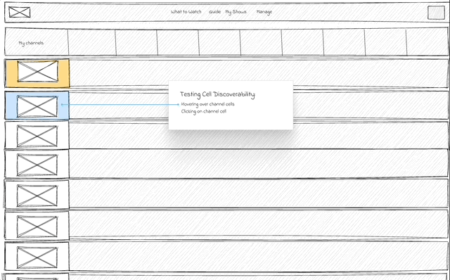
After I had the key screen wireframes, a prototype was put together in Figma and UIzard where I conducted usability testing with 10 participants. Below are the different scenarios the participants were asked to complete:
Task #1: User wants to interact with channel cells.
Task #2: User wants to learn more about a channel.
Task #3: User wants to favorite or unfavorite a channel.
-
After establishing the design strategies and user needs, I worked to outline the sitemap. From here, I started to ask some important questions.
What sort of features/screens are needed for an optimal viewing "experience" ?
At what point should the user be able to access the channel info card?
What happens when they access it? what could they do?
-
Once the general skeleton of the site was set, I considered how a user might engage with each screen to complete certain tasks.
My Role
By synthesizing user feedback, analyzing data, and leveraging online research tools for customer insights, we acquired valuable information about the challenges users encountered. These are some of the prominent pain points that users mentioned.
User Painpoints
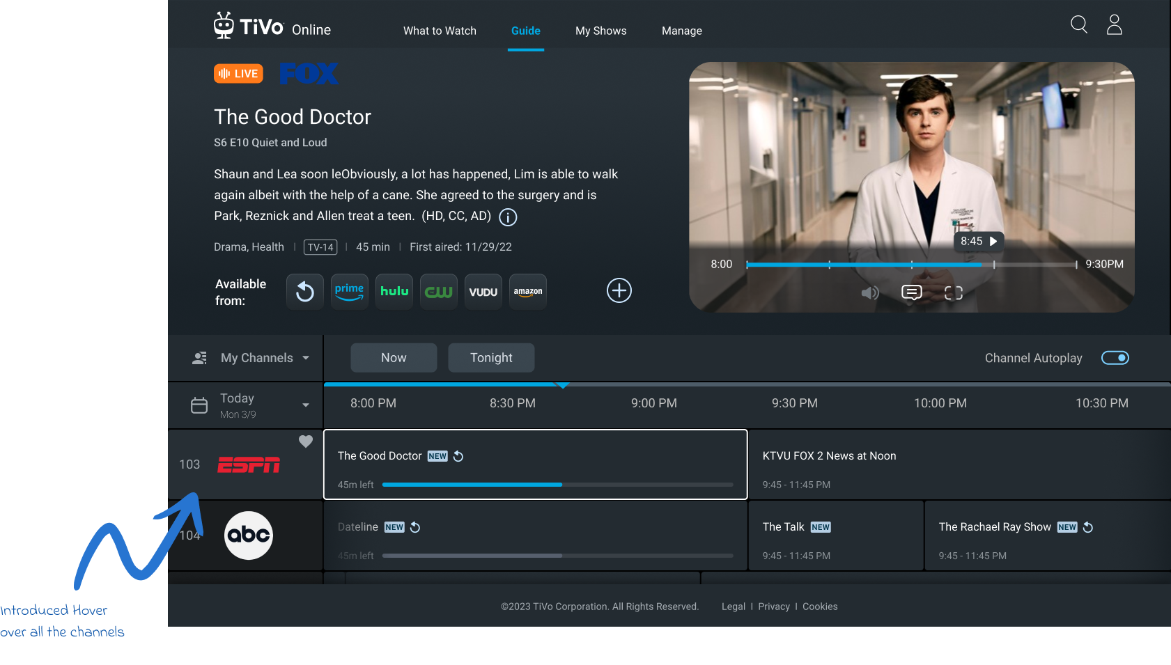
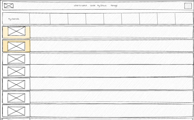
There is no indication that the user can click on guide channel cell.
Pain Point 1

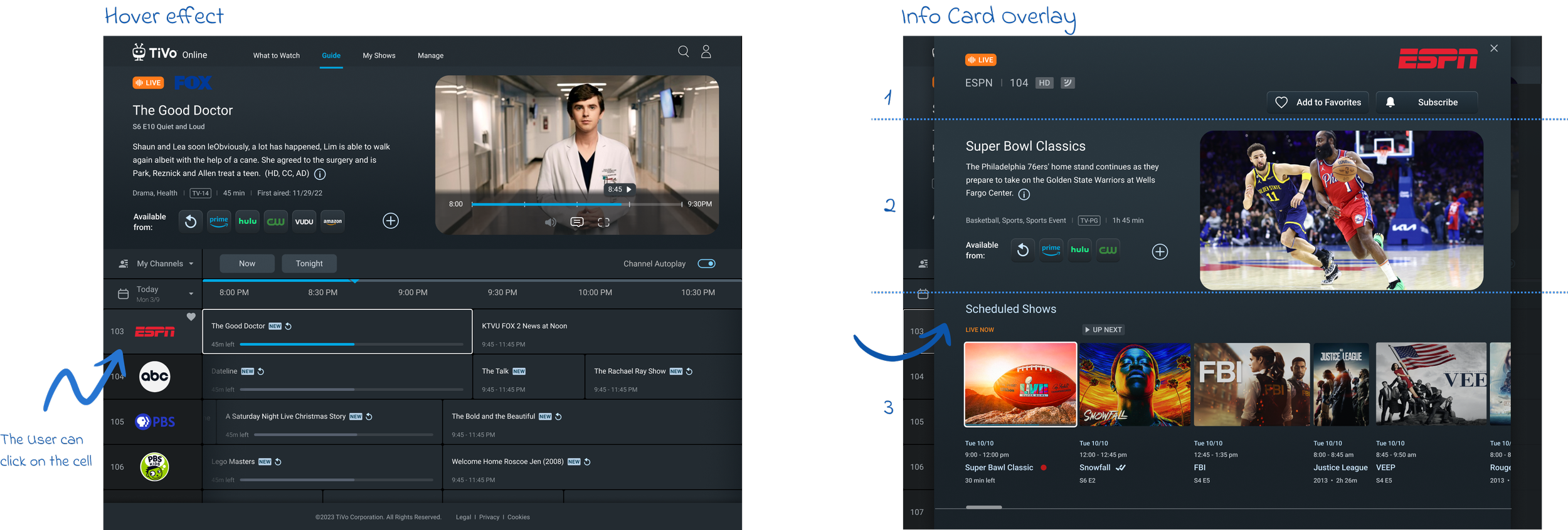
Introducing hover function over each guide channel cell that allows the user to click on that cell.
Design Solution 1
User has no ability to to learn about the channel details.
Pain Point 2
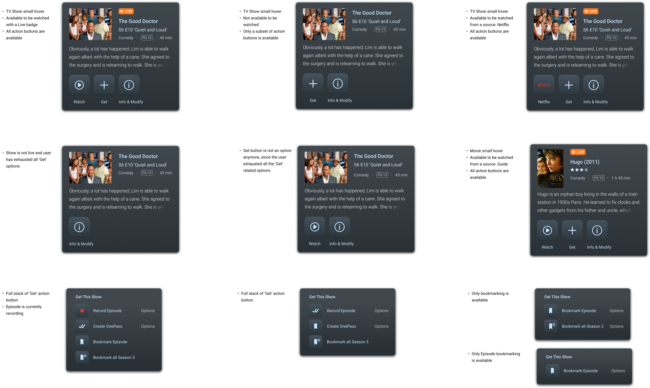
Upon clicking the channel cell, the Channel Info Card overlay is activated. This overlay is thoughtfully divided into 3 sections:
The 1st section is dedicated to the channel itself, providing key information and branding.
The 2nd section focuses on the content of the currently highlighted show, offering users a deep dive into what they can expect.
The 3rd is reserved for a timeline of scheduled shows, enabling users to easily navigate and plan their viewing experience. This structured layout ensures that viewers have all the necessary information at their fingertips, enhancing the overall user experience.
Design Solution 2
It is cumbersome to Favorite and Unfavorite channels.
Pain Point 3
Introducing instant favoriting in the new redesign. The heart outline appears on hover over the channel cells and user can favorite or unfavorite the channel in 1 click.
Another way of favoriting is through the CTA in the Channel Info Card. ‘Add to favorites’ will become ‘Remove from favorites’ instantly.
Design Solution 3

Early Prototypes
The process of quick prototyping underwent rigorous user testing, during which we gathered valuable feedback. This feedback played a crucial role in identifying the most promising design option, which we then selected for further refinement.
3 design options were presented to the stakeholders
-
![]()
Channel Info Card V1
This is the version with 3 sections: Channel Metadata at the top, Show metadata and a player in the middle, and scheduled show section at the bottom.
-
![]()
Channel Info Card V2
This option doesn’t display the show metadata. It is focused on the channel metadata at the top and scheduled shows.
-
![]()
Channel Info Card V3
This option shows the channel section at the top separated from the scheduled show section, and the scrolling of the shows is represented with bars instead of dragging.
Following the selection of design version 1, I embarked on an extensive creation phase producing multiple design boards and wireframes. These materials comprehensively covered all existing use cases, ranging from user interactions to parental controls, error messages, fallback image rules, and other significant design nuances.
Design Boards
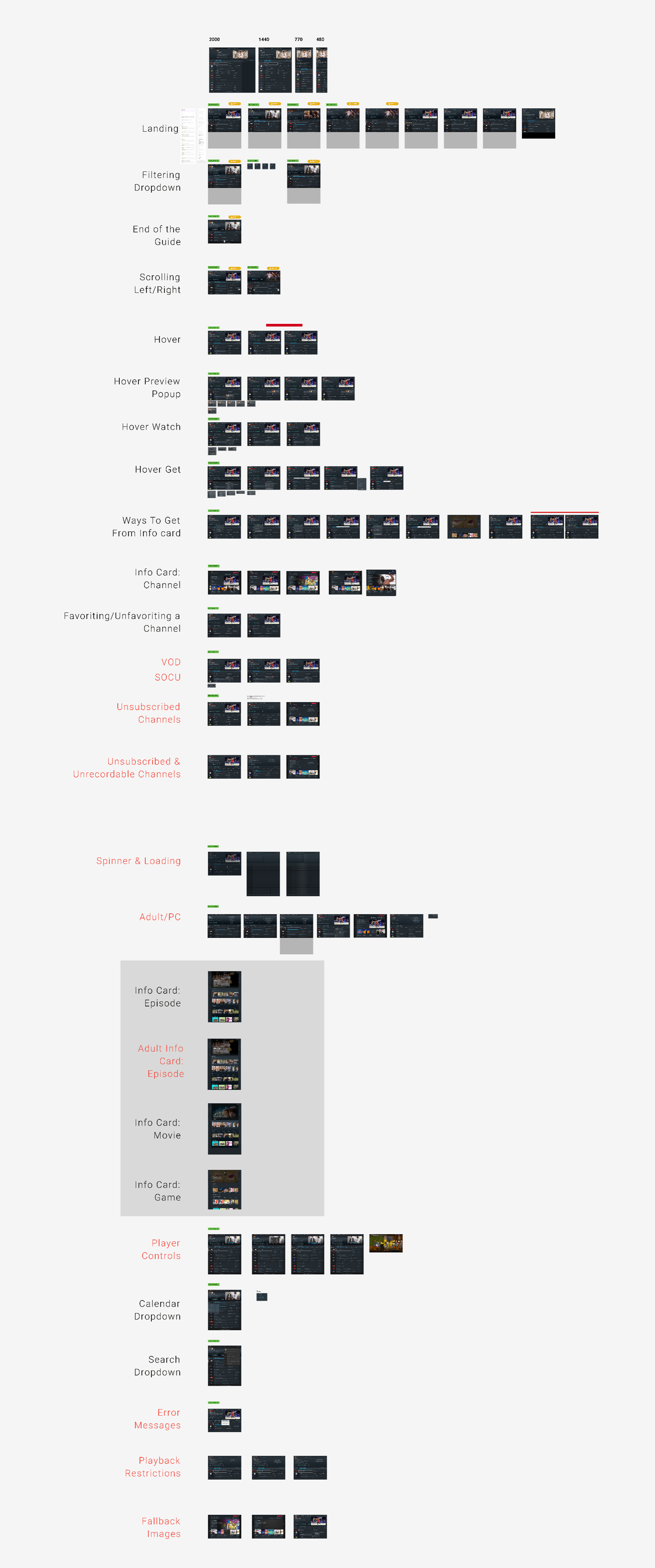
Interaction Elements